Building your own dashboards for observability#
| Short Description | Creating dashboards that enhance operational visibility |
| Difficulty | Beginner |
| Topology Nodes | client11, client13, leaf11, leaf12, leaf13 |
| Reference | Dashboard designer documentation |
Nokia EDA platform not only excels in event-driven, declarative configuration management based on abstracted resources, but also provides a rich feature set for operational visibility and monitoring. One of such features is the ability to create dashboards with live visualizations of state and health metrics of the abstracted resources used by the platform.
Besides the dashboards shipped with the platform, you can create dashboard of your own displaying the data most relevant to your operations teams and services. The Dashboards section, found under the System category, lets you build a dashboard composed of one or more layouts. Each layout serves as an individual dashboard page, accessible via a drop-down menu on the main dashboard interface.
Dashboard-based observability allows operators to gain insight into their network quickly, with dedicated visualizations showing only the data that is relevant for the problem at hand. This will come in handy during those pesky P0 outage calls everyone tends to have every few years. In addition, customer-specific dashboards allow your technical support team (or even the end-customers themselves?) to quickly diagnose their network.
1. Objective#
The goal of this exercise is to build a custom dashboard that will display some useful statistics and health metrics of a network instance (aka VRF) in your network. This dashboard will give you a quick overview of the route table of an overlay network instance in your network. Note that this exercise only scratches the surface of the dashboard designing process and will not cover all the features and capabilities of the dashboard designer.
2. Technology explanation#
The dashboard designer operates on the top-level building blocks such as:
- dashlets - objects that describe the graphical elements
- EDA queries provide the live-streaming data for the dashlets to display
- flex rows and columns - Sectional layouts for placing dashlets
To help you understand how these building blocks work together, take a look at one of the dashboards that comes pre-packaged with EDA. Navigate to the Fabrics resource group under the Fabrics category1: you should see the srexperts-fabric resource that is supporting the hackathon infrastructure. Press the view selector at the top-left and select 'Summary'.
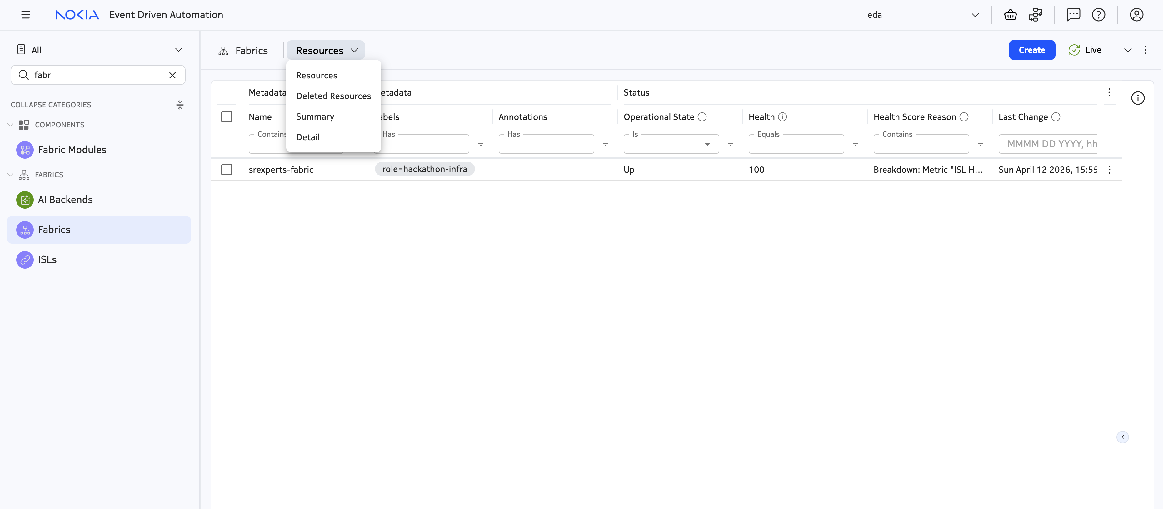
You are greeted with an operational dashboard displaying some of the information relevant to all fabrics configured in your network:
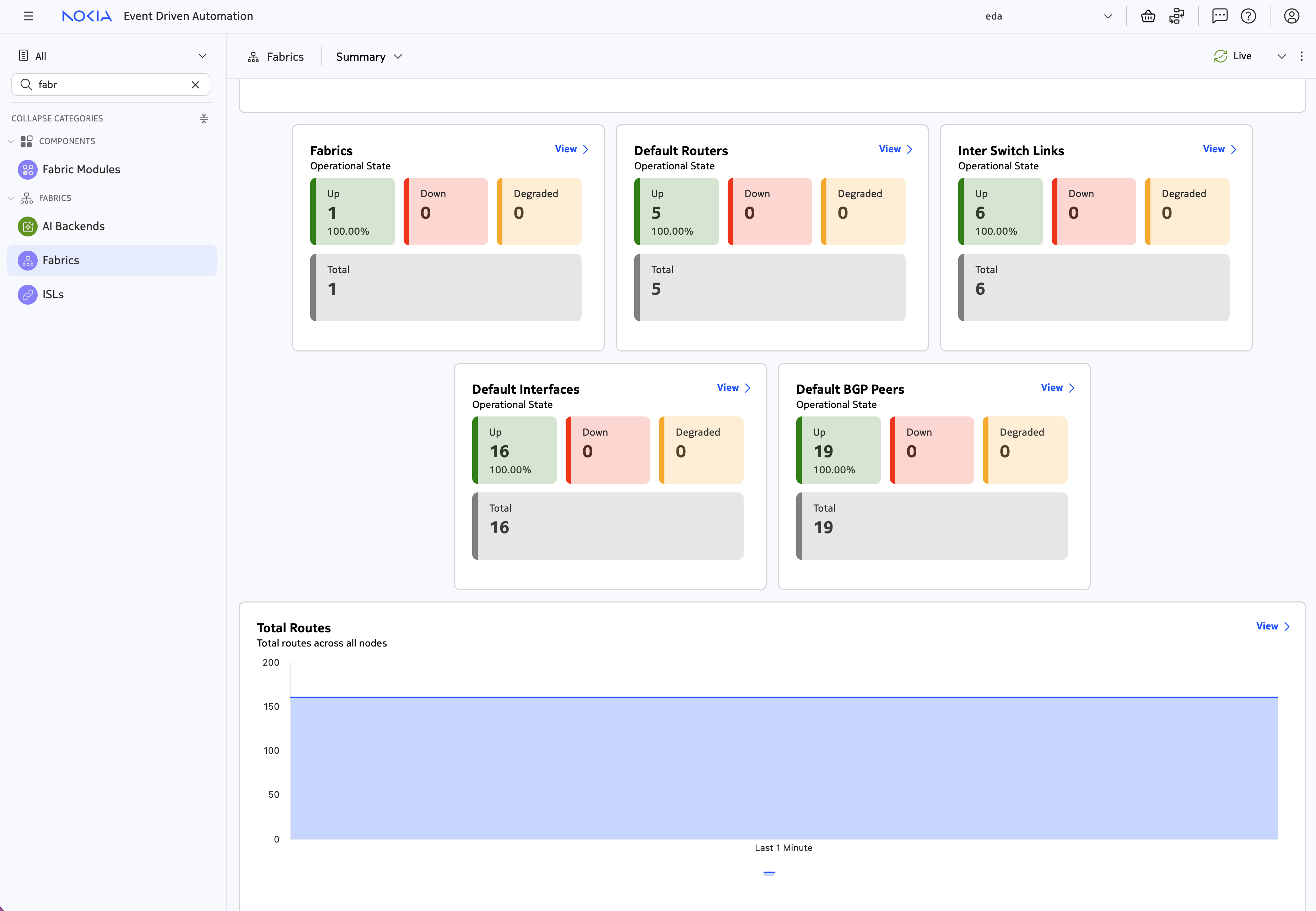
- The number of network elements, for each role, that are configured as part of at least one fabric.
- Current alarms for
Fabricresources. - Information about the resources that the
Fabricresources create, such asDefault Routers,Inter Switch Link,Default Interfaces, andDefault BGP Peers. Each set of counters displays the total number of resources, along with their operational statuses. - A live view of the number of routes in the default routing table of the fabrics, across all nodes.
Every dashboard uses the EDA Query Language to gather these metrics: they are either retrieved directly from the nodes, or through normalized EDA status resources, but always in the streaming fashion. You can view the query (and the resulting data table) by pressing the "View" button in the top-right of each dashlet.
2.1 Inspecting the Fabrics summary dashboard#
Let's take a look at how the Fabrics summary dashboard we've seen above is created by opening this dashboard in the Dashboard Designer. To find the Fabrics summary dashboard, navigate to the Dashboards section under the System category.
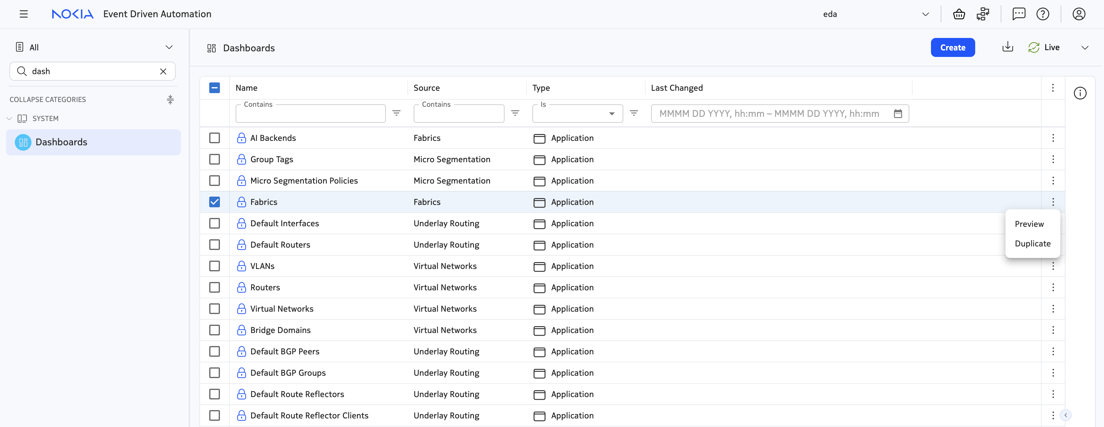
You can learn a lot about the dashboard designer capabilities and how to use them by inspecting the existing dashboards. To open the Fabric dashboard in the designer, click on the three dots next to the dashboard name and select "Duplicate".
Below is a screenshot of the dashboard designer and a brief overview of the most important buttons.
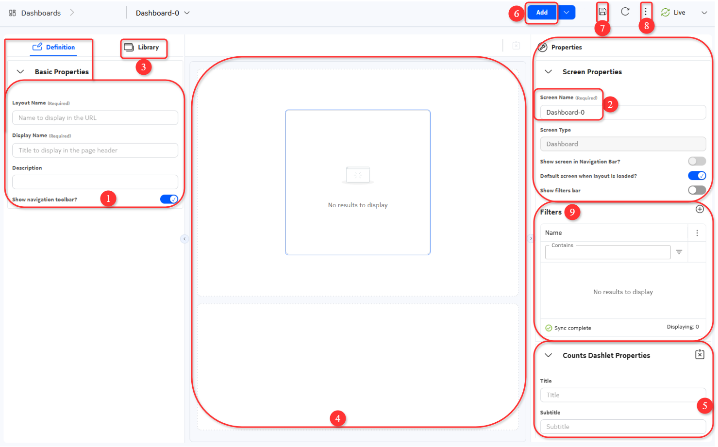
- Provide a Layout Name and a Display name for your dashboards. The former is the name that appears in the Dashboard page list and the latter is the name shown when we preview the dashboard.
- Dashboards can have multiple dashboard screens. So we need to provide a name for each one. We do this in the Screen Name.
- If we click on Library we can see two new sections:
- Flex: these objects allow us to order the dashlet elements in columns or rows. Each can be dragged and dropped onto your dashboard canvas (the center workspace).
- Dashlets: these are the core components of your dashboard. Several types are available, depending on the kind of data or visual representation you need.
- After dragging and dropping an object in the canvas area, you can check the properties of these Flex and Dashlet objects by clicking on them.
- The properties appear at the bottom right of the screen. We will go into more detail in the next section.
- If our layout is composed of multiple screens, we can add those with the Add button. We would then iterate over steps 2-5.
- Once we feel our layout is ready, we can save the current dashboard design.
- Now you can preview it by clicking the More icon. You could also export your design as a json file, suitable for others to import into their EDA system.
- Filters can be used to further refine the queries that our data retrieves.
When the dashboard is opened in the designer mode, you can select the individual dashlets and inspect their configuration by opening the "Properties" panel on the right side of the screen. Let's scroll a bit down the view and select the dashlet titled "Fabrics" and open the properties panel by clicking on the wrench icon in the top-right.
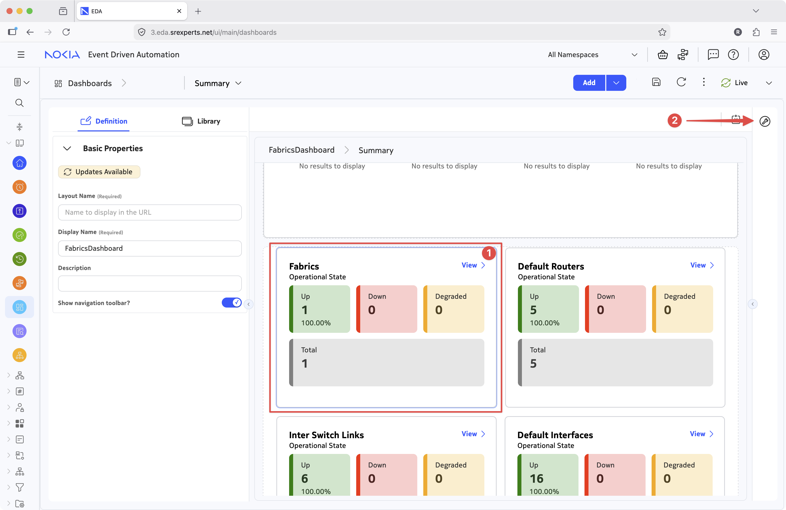
The properties panel will contain the configuration elements for the selected dashlet. In this case, we can see the dashlet type is - Counts dashlet - a type of dashlet that displays a count of the items returned by the query. Evidently, the dashlet counts the number of fabrics configured in your network, more precisely, the number of Fabric resources in each operational state.
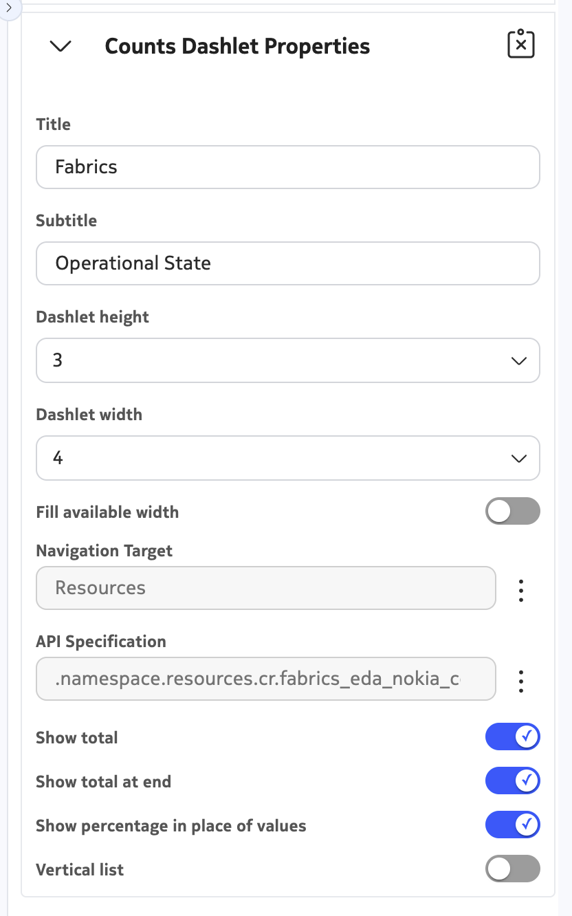
To understand how this dashlet works, let's zoom in on the dashlet properties:
The dashlet properties allow you to configure the dimensions of the dashlet, the flex layout and, more importantly, the data source for the dashlet. To see how the dashlet is configured to display the number of fabrics in each operational state, click on the three dots next to the "API Specification" field, which should bring up the new window with query details for this dashlet.
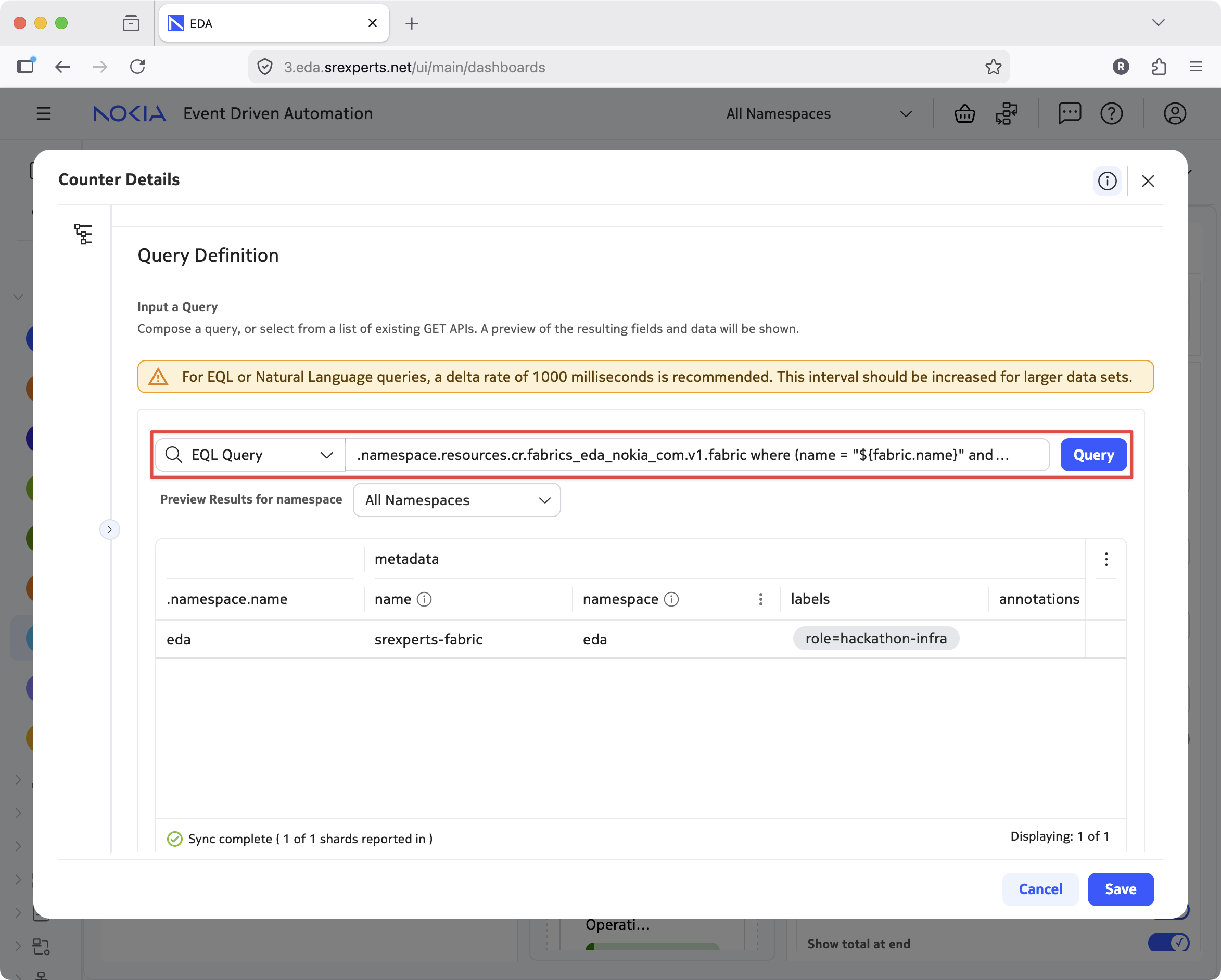
The query you see selects the fabric resources, the output of the query is just below the query input field, showing one entry related to the srexperts-fabric resource each setup has. The results of the query are the data source for the dashlet itself. Scroll down the view to see how the count dashlet is selecting on the various fields of the query results:
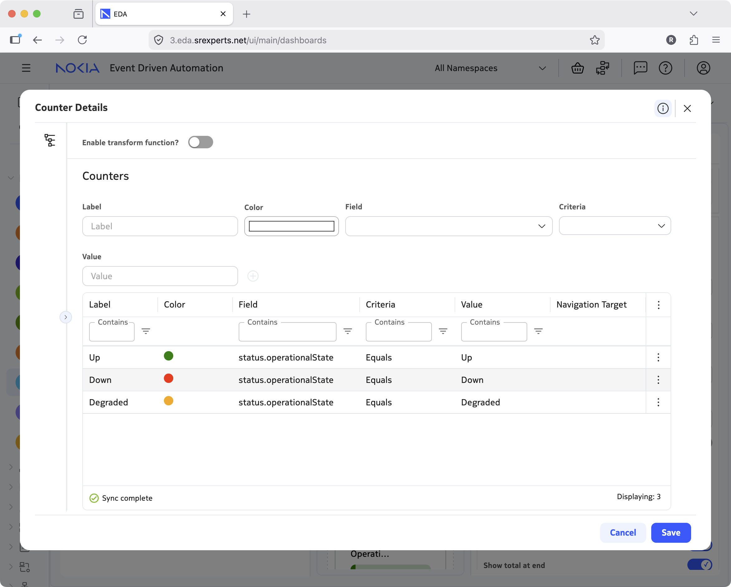
See how in the Counters section we defined the three labels that will be displayed in the dashlet: Up, Down and Degraded, assigned the colors to them and created the conditional logic that consists of the Field, Criteria and Value fields.
The results returned by the query will be evaluated against the conditional logic and the matches will be counted and displayed in the dashlet. Simple, yet effective.
The designer has different dashlets, and the data source can be filtered and transformed via the transformation logic to give you more flexibility, but this is left for you to explore on your own through the tasks ahead.
3. Tasks#
3.1 Creating your own dashboard#
Now, let's create our own dashboard that will give us insight into the routing table of a Router.
You are not limited by the dashboard suggested by this activity and can create a dashboard for any use case you can think of.
A Router in EDA is a resource that represents a Network Instance or VRF and is a critical building block of datacenter infrastructure, ensuring network elements such as VM hypervisors and firewalls (just to name a few) can communicate with each other, isolated from other communication streams.
If you want to learn more about routers in EDA, you are encouraged to check out the exercise on Routers either before or after completing this one. The dashboard you will be creating in this exercise can also help you visualize what happens while going through that exercise.
Navigate to the Dashboards section under the System category, and press the "Create" button in the top-right. Give your dashboard a name and an optional description and press the save icon to create a new dashboard.
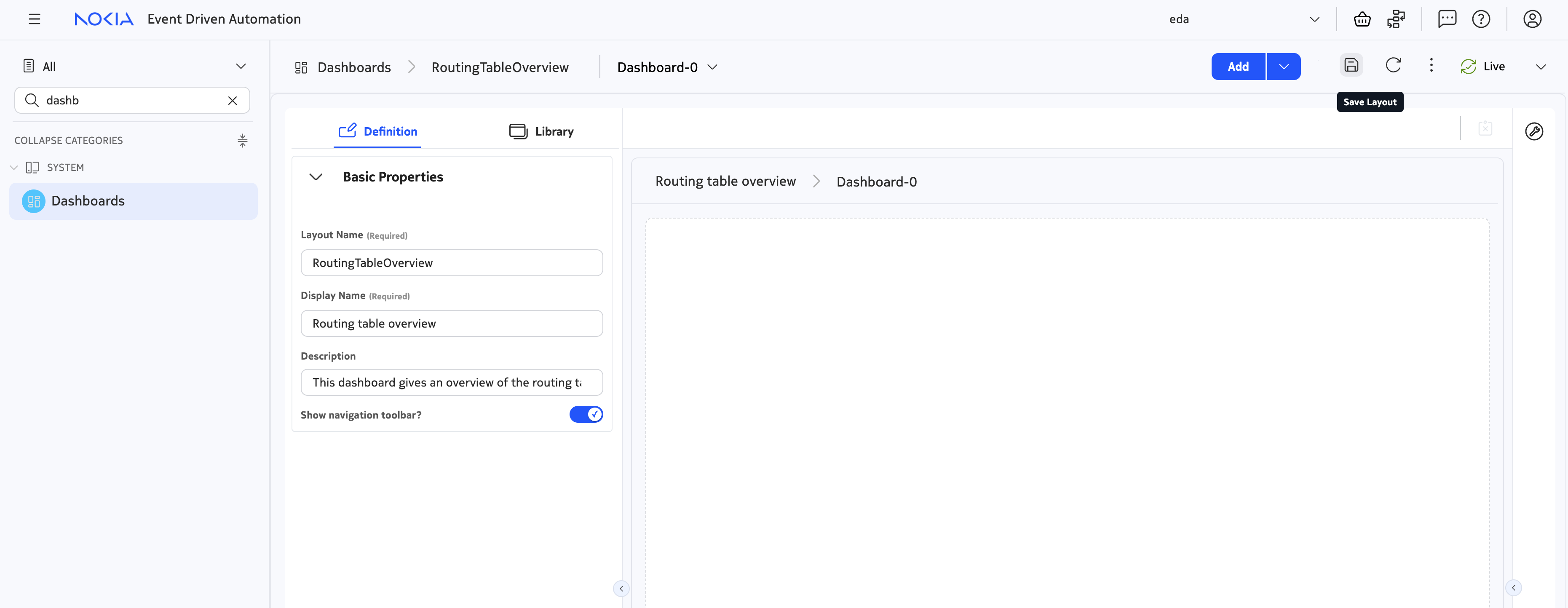
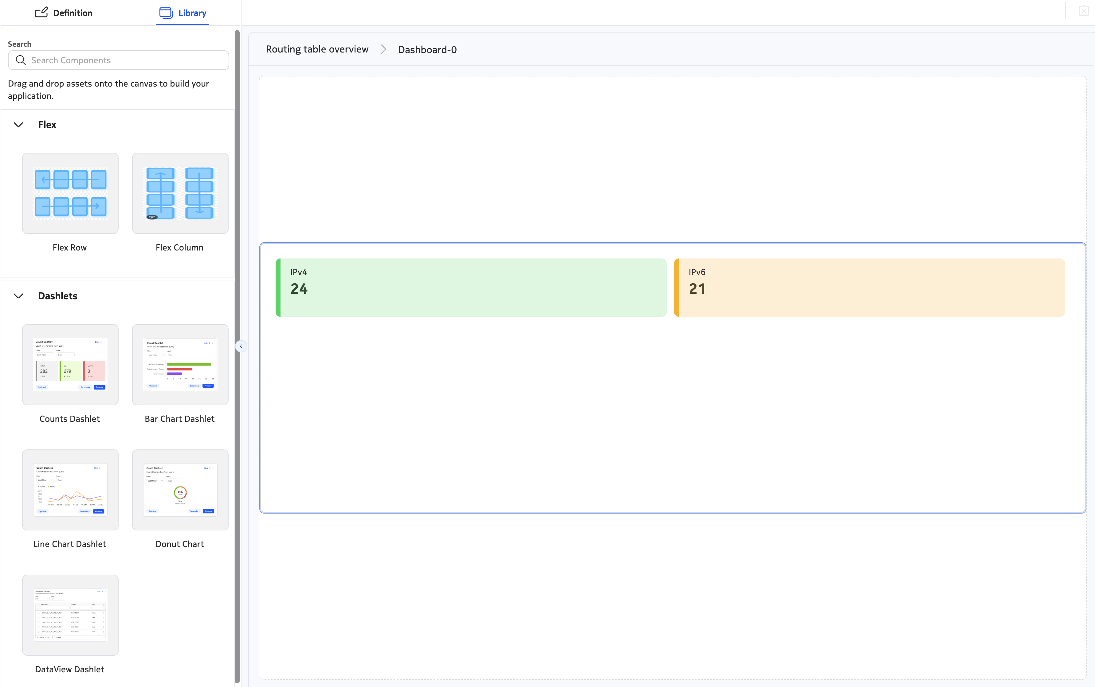
3.2 Adding our first dashlet#
Drag the "Counts dashlet" to the flex row element that exists by default. We will use it to give an overview of the number of IPv4 and IPv6 routes that are present in our virtualized routers.
Click the Counts dashlet and perform the following tasks in the Count Dashlet Properties window:
- Give the dashlet a name
- Set the height to 4
- Configure the dashlet to fill the available width in the row
Next up, we will add the query that the count dashlet will use to display the data.
Description of the query we want to create
The focus of this exercise is on dashboards, not on EDA queries. The queries used in this exercise are contained in a spoiler container that is collapsed by default, should you want to try to come up with these queries yourself.
For this step, we are looking for a query that accesses the normalized Router (application services.eda.nokia.com/v2). Use the sum([field-name]) as [field-name] operator to group all nodes together to yield a single value for the number of IPv4 and IPv6 routes (see screenshot below)
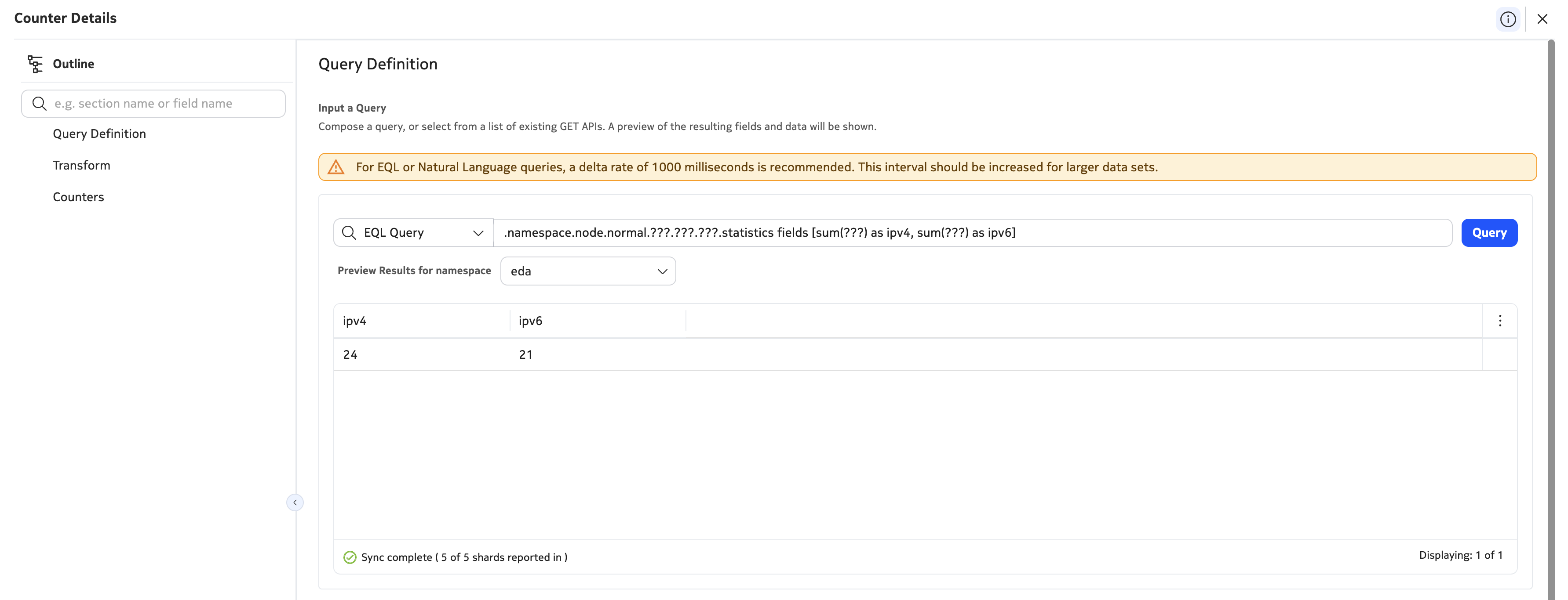
Next, visualize the counters by giving them a name and a color. The IPv4 and IPv6 routes should be visualized by different counters.
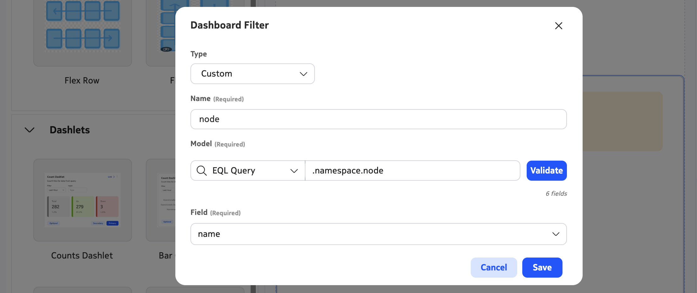
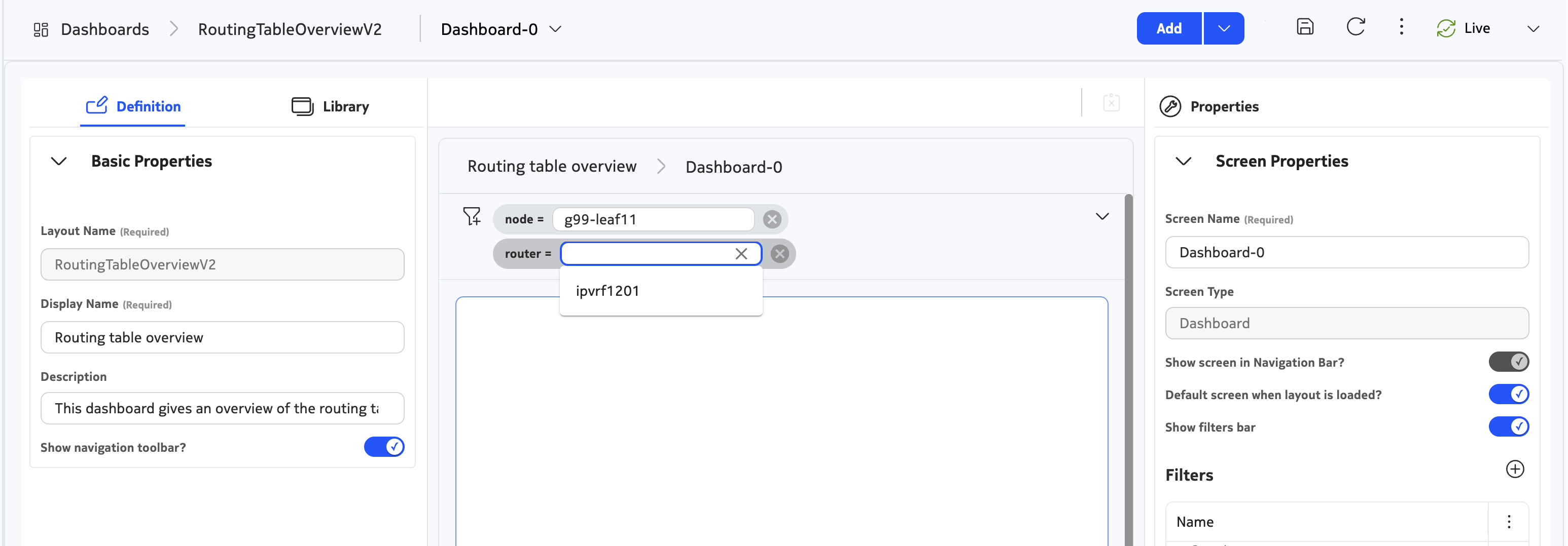
3.3 Filters#
While creating this query, you may have realized that these values are more useful when limited to a particular node and service: that's where filters come in. Filters are parameters that the user can configure while looking at the dashboard, and can be integrated into queries to dynamically update what is being visualized.
There are multiple filter types, but the most useful is 'Name / Namespace'. This allows your dashboard to filter an EDA resource by both its name and namespace, ensuring global uniqueness.
Create two new filters:
- The
nodefilter that allows a node to be selected - The
routerfilter that allows a Router service to be selected
Filters are case-sensitive
Filter names are case-sensitive! As we will see in just a second, you will reference the values of these filters by using the "${[filter-name]}" syntax. To avoid confusion, we recommend to only create filters with lower-case names in this exercise.
While selecting a type for your filter, choose the "Custom" type: this allows the dashboard to auto-suggest values for your filter.
Filter auto-completes
The EQL queries for these filters should auto-suggest the name of a node or Router service, for the node and router filters respectively.
To configure these filters in the dashboard designer, or in the preview window, enable the "Show filters bar" toggle in the screen properties. After that, you should now be able to select different nodes and Router services using the filter bar. However, note that the counter dashlet does not yet update when we filter values: we will fix that in the next task.
3.4 Rewrite the query to use filters#
Update the query of the counters dashlet, ensuring filter values are now taken into account in the dashboard. Filters can be referred to by using the ${[parameter-name].name} and ${[parameter-name].namespace} syntax. For example, instead of providing the following where clause ... where (.namespace.node.srl.network-instance.name == "my-router"), you can add a filter named router and rewrite the filter as follows: ... where (.namespace.node.srl.network-instance.name == "${router.name}" and .namespace.name = "${router.namespace}").
Modified query
The EQL query is an adaptation of the previous query, but filters by node and router service, which can be used in the query like where (??? = "${node.name}" and .namespace.name = "${node.namespace}"). To make debugging easier, consider removing the sum operator and using the table to debug.
Observe that your counters dashlet now updates when you update your filter!
3.5 Inspecting the actual routes#
Next up, we will create a table view that queries the underlying SR Linux nodes and displays all the EVPN route types. For the remainder of the exercise, you can focus on just IPv4 routes, as the principles are the same for IPv6 routes.
Perform the following tasks:
- Add a new Flex Row under the one containing your counters dashlet
- Add the DataView dashlet and configure it:
- Give it a name
- Set it to fill the available width
- Set the height to 4
- Enable the "Show status bar" slider
Next up, add a query similar to our counter dashlet.
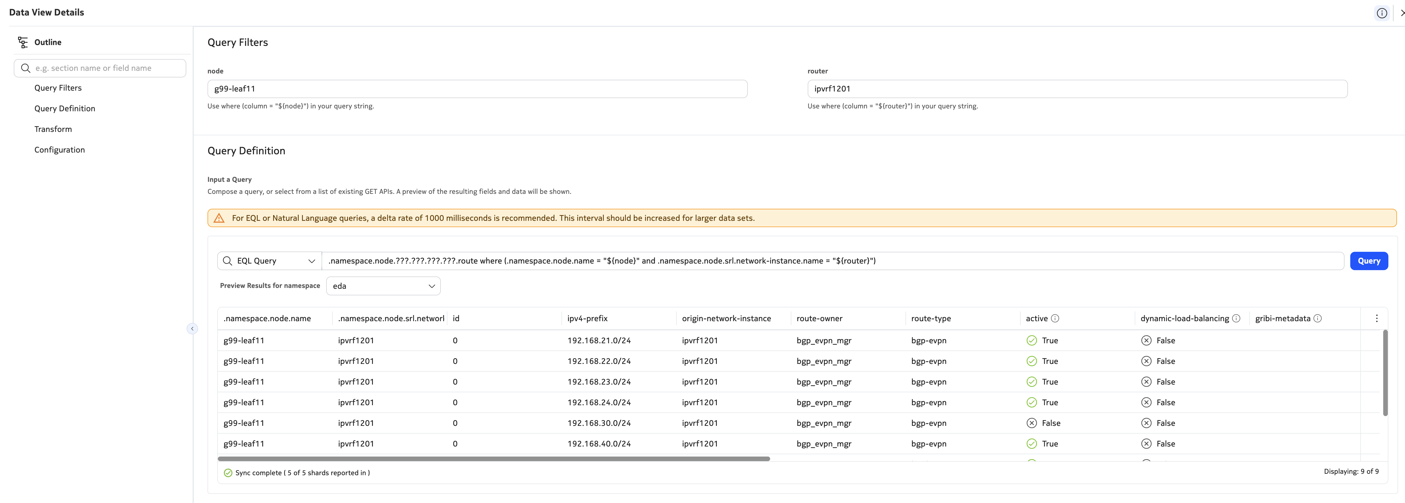
Visualizing the routing table
This query will go deep into the routing table of a virtualized router service. Unlike the previous query, we don't have a normalized data model that we can use here, so the query you are creating will only work on one operating system (SR Linux, in our case).
The query will:
- Inspect the route table of all SR Linux network-instances
- Access all ipv4-unicast routes
- Filter based on the node and router values that your dashboard provides
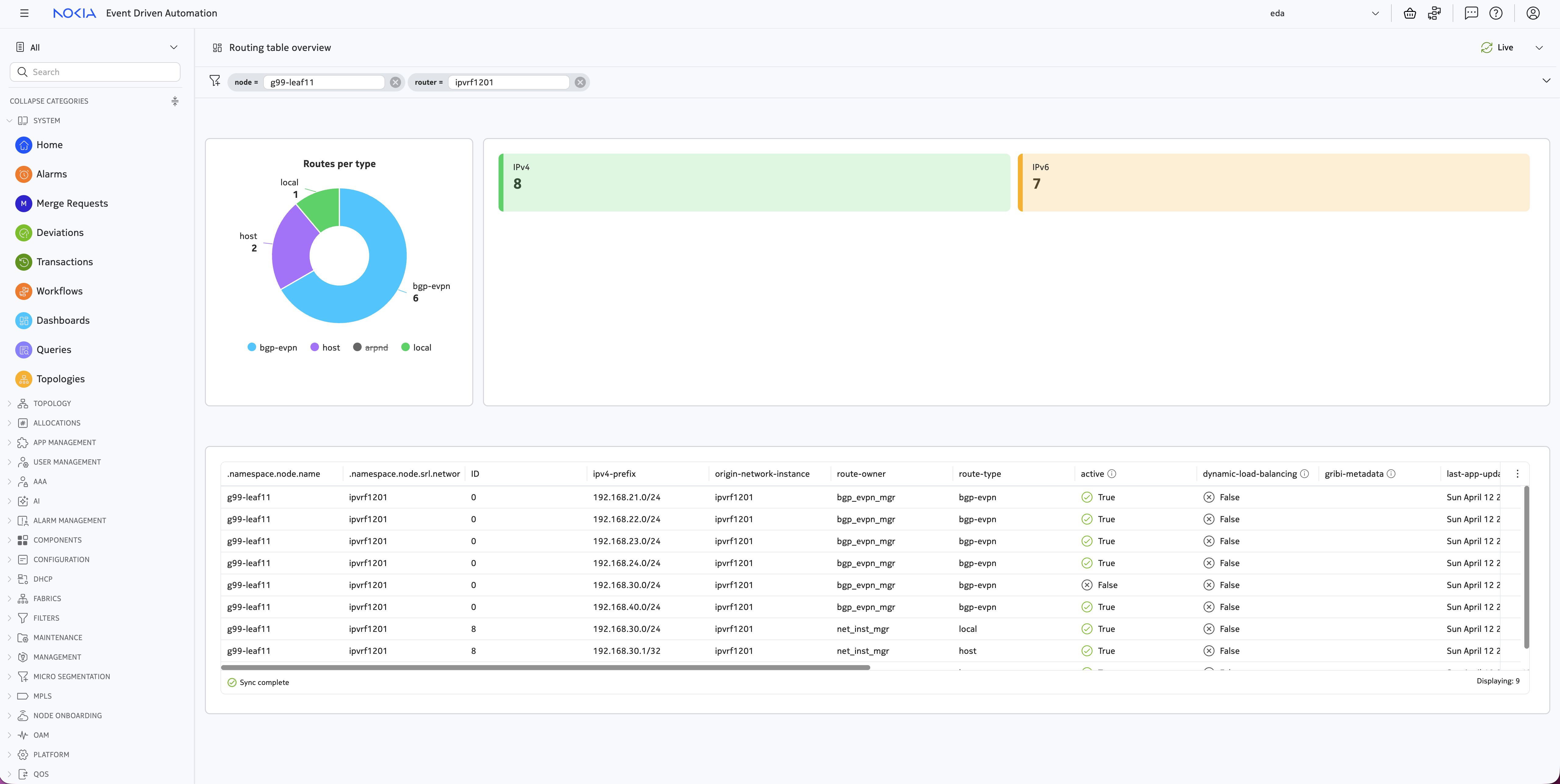
3.6 Doh, Donuts#
As a final exercise, let's group the routes you retrieved in the previous step and visualize them in a donut chart. Use the knowledge you gained in the previous two exercises to:
Create a donut dashlet:
- Place it to the left of your counter dashlet
- Give it a name
- Set the height and width to 4
- Add a chart
- Re-use the same query as the previous task
- Set the chart thickness to Thick
- Add 4 slices with different colors. Filter on
route-typebgp-evpnroutes are EVPN routes learnt from remote sourceslocalroutes are prefixes that are reachable on the box itselfhostroutes are IP addresses configured on the node, such as gateways and broadcast IPsarpndroutes are IP addresses detected on a directly connected subinterface
Enjoy the fruits of your labor by saving the dashboard and previewing it.
Import this dashboard
If you got lost somewhere along the way, or just want to inspect the finished result, you can import the dashboard using this JSON file.
-
You can use the search bar in the left menu to find the Fabrics resource group by typing 'Fabrics'. ↩